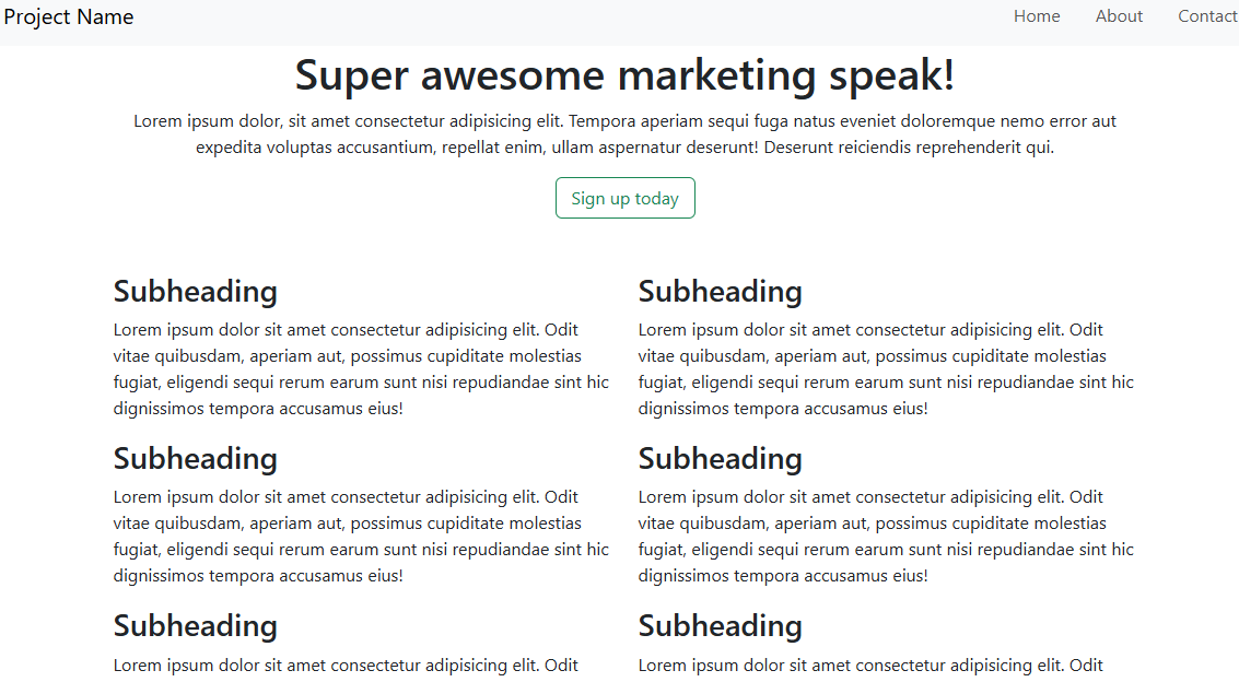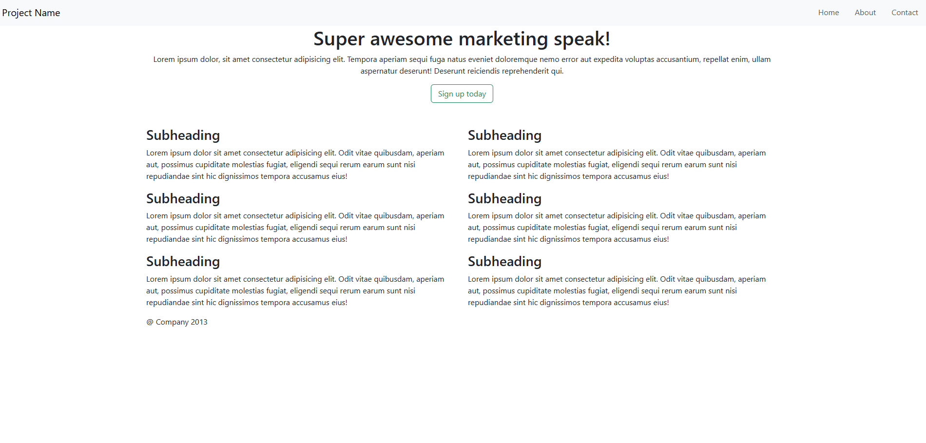
Overview
This project demonstrates the power of CSS and Bootstrap in creating a responsive web design. The website adjusts seamlessly across devices, providing an optimal user experience on desktops, tablets, and mobile phones.
Technologies used:
- CSS for custom styling
- Bootstrap for responsive layout and components
- Media queries for additional customization
Key Features
The website includes several features to enhance user experience and showcase modern design principles:
- Responsive grid layout using Bootstrap's flexbox system
- Custom animations and transitions with CSS
- Interactive navigation bar and buttons